A Gallery That Unfolds for Rapidweaver Elements
A gallery that unfolds – hover or tap, and one photo takes the center stage
PhotoSpread turns three to six images into an interactive fold gallery – hover on desktop or tap on mobile, and the chosen panel expands to fill the space while the rest tuck neatly aside. Every panel can hold more than just a photo: drop in a Container with text, buttons, or links, and it all unfolds together with the image the moment that panel takes the stage. Choose horizontal or vertical folding – side by side on a wide screen, stacked on a phone – and fine-tune exactly how it feels: the fold speed and easing, a border around every panel, and a second border color that only lights up on the one that's currently open, so visitors always know at a glance which image is active.
Add your images and optional content, and publish.
Some Examples
Winter Wonderland
This Winter Wonderland example pairs PhotoSpread with WeaverPixel's FlurryPixels component, layered underneath as an optional background. FlurryPixels adds the gently falling snowflakes drifting behind the panels, while PhotoSpread takes care of the image fold itself.
The two components work entirely independently, so FlurryPixels is optional here – leave it out if you'd rather keep the plain fold effect without the snow.
A Cosy Place To Relax
Consectetur magna laboris sint consequat pariatur occaecat amet velit consectetur excepteur. Aliquip duis minim do eiusmod dolor nulla voluptate sit reprehenderit consectetur tempor. Eiusmod tempor duis cillum dolor velit nulla commodo irure nulla officia duis. Pariatur aliqua qui fugiat sint cupidatat. Labore aliquip qui Lorem eu proident dolore quis veniam incididunt sit.
Do You Like A Hot Cappuccino?
Consectetur magna laboris sint consequat pariatur occaecat amet velit consectetur excepteur. Aliquip duis minim do eiusmod dolor nulla voluptate sit reprehenderit consectetur tempor. Eiusmod tempor duis cillum dolor velit nulla commodo irure nulla officia duis. Pariatur aliqua qui fugiat sint cupidatat. Labore aliquip qui Lorem eu proident dolore quis veniam incididunt sit.
Cold Feet?
Consectetur magna laboris sint consequat pariatur occaecat amet velit consectetur excepteur. Aliquip duis minim do eiusmod dolor nulla voluptate sit reprehenderit consectetur tempor. Eiusmod tempor duis cillum dolor velit nulla commodo irure nulla officia duis. Pariatur aliqua qui fugiat sint cupidatat. Labore aliquip qui Lorem eu proident dolore quis veniam incididunt sit.
My Sleeping Dog
Consectetur magna laboris sint consequat pariatur occaecat amet velit consectetur excepteur. Aliquip duis minim do eiusmod dolor nulla voluptate sit reprehenderit consectetur tempor. Eiusmod tempor duis cillum dolor velit nulla commodo irure nulla officia duis. Pariatur aliqua qui fugiat sint cupidatat. Labore aliquip qui Lorem eu proident dolore quis veniam incididunt sit.
Component Settings
Orientation: Choose whether PhotoSpread folds side by side (Horizontal) or stacks top to bottom (Vertical). This setting is responsive, so you can pick Horizontal for larger screens and switch to Vertical for phones – just click the small breakpoint icon next to the control, exactly like Elements' own responsive controls.
Number of Panels: Set how many images PhotoSpread shows, from 3 to 6. Only that many of the Slot sections below become active – the rest stay hidden on the published page.
Default Active: Choose which panel is already expanded when the page loads. If you set this higher than Number of Panels, PhotoSpread automatically falls back to the last available panel instead.
Height: Sets the overall height of the gallery – the cross-axis height in Horizontal orientation, or the total height in Vertical orientation. Works exactly like Elements' own Height control, including the Custom pixel option.
Gap: The space between panels, taken from your theme's spacing scale.
Editor Preview – Active Slot: This lets you choose which Slot is shown expanded and editable directly in the Elements canvas – handy for editing a Slot's text or button without switching to Preview mode every time.
Slot 1 through Slot 6 are identical – each one controls a single panel in the gallery. All six sections always appear in the Inspector, regardless of Number of Panels above; you can still fill in a Slot beyond that count, but it's simply ignored on the published page.
Background Style: Choose what fills the panel – an Image, a flat Color, or a Gradient. Switching styles reveals only the fields that setting needs.
Image / Image Position: Pick the image for this panel, then choose which part of it stays visible – Center, Top, Bottom, or one of the four corners – exactly like Elements' own background image controls. Useful when an off-center subject would otherwise get cropped out as the panel folds between narrow and wide.
Color / Opacity: A flat theme color for this panel, with adjustable opacity.
Direction / From Color / From Opacity / To Color / To Opacity: A two-stop gradient for this panel – pick a direction, then set the starting and ending color and opacity.
Panel content: Drop a Container onto the panel in the canvas to add an optional caption, button, or any other content – it appears together with the image whenever that panel is active.
Function: The easing curve for the fold animation – Linear, Ease-in, Ease-out, Ease-in-out, or Custom for your own cubic-bezier curve.
Duration: How long the fold animation takes, in milliseconds.
Delay: How long PhotoSpread waits before starting the fold animation, in milliseconds.
Borders: Style, Color, Opacity, Width, and Radius work exactly like they do on every other Elements component. Type also offers Active, letting you set a second border color that only lights up on the panel that's currently expanded.
Overlay: Color, Opacity, and the Gradient fields work exactly like Elements' own Background controls. Type lets you turn the overlay off entirely, and Style switches between a flat Color or a Gradient behind the panel's content – the default gradient fades from a dark color at the bottom into full transparency, keeping text readable without darkening the whole image.
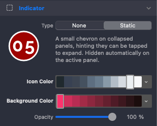
A small chevron on every collapsed panel hints that it can be tapped or clicked open – especially useful on touchscreens, where there's no hover state to give it away. Type turns the indicator off entirely if you don't need it; Icon Color and Background Color set its look, with Opacity controlling how solid or subtle that background appears. It fades out automatically the moment its panel becomes the active one.
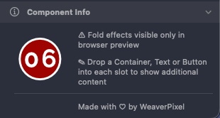
PhotoSpread's fold animation runs entirely in the visitor's browser – the Editor canvas doesn't execute JavaScript, so panels always show side by side there instead of folded. Use the Editor Preview – Active Slot setting under Layout to check how an individual panel looks and edit its content directly in the canvas.
Each panel's content area accepts any Elements component – Containers, Flex, Grids, Text, Buttons, and much more. A Text component works as a caption, a Button as a call to action – whatever you place there appears together with the image when that panel is active.

A Gallery That Unfolds for Rapidweaver Elements